|
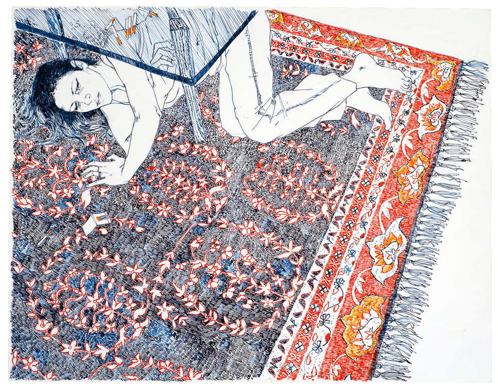
I love color. I enjoy the reaction of color that happens in different light situations, the playfulness of color in fashion, and the way a variety of visual artists use color to accent, disguise, and illustrate. Color has a way of colliding in certain ways that can attract or even detract the eye. It can be used in subtle gestures to move the eye through a frame, or to boldly declare small intentions of space. Take Hope Gangloff, who's work I admire, for example. Her ability to create visual narratives using simple, everyday still life moments using her friends, her family, and her living space create a richness in her artistic style. Her bold use of color creates dramatic texture, playful patterns, and an unusual sense of movement and scale within her work. 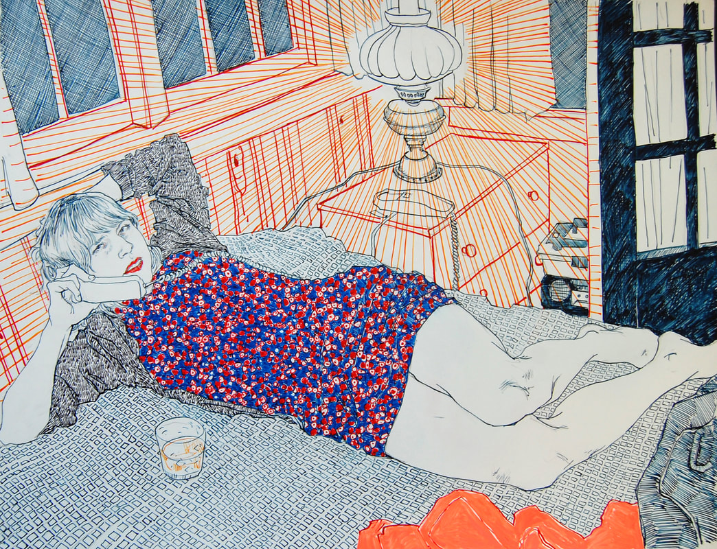 “The most uncommon color combinations do the strangest things." - Hope Gangloff I recently read an article about Hope in The New York Times - "In the Studio with an Artist who paints in a Color Trance". As a photographer who doesn't enjoy being in front of the camera (who's with me?), I can associate with Hope's desire to not have her face photographed, that simply being a painter is what matters (not her face, or her gender). I also enjoy her fiercely political nature, and that her love of art is what drives her ambition - not lucrative commissions. 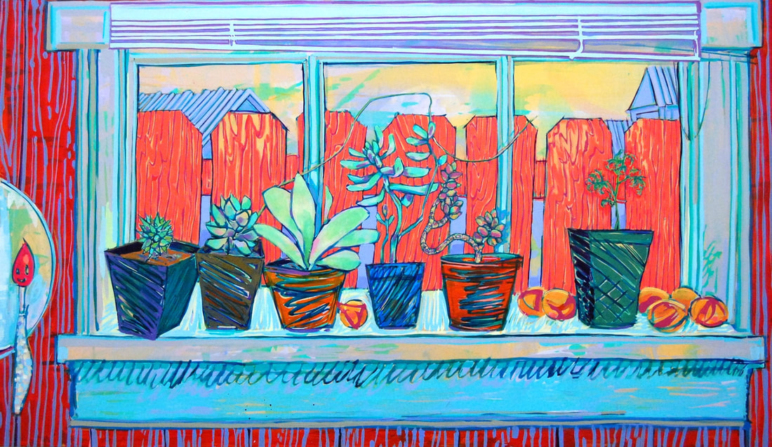 What really keeps me coming back to Gangloff's work is her David Hockney-esque ability to articulate nature and humanity in aggressive yet pleasing color interactions. That graphic quality just sings to my eye, and it is something that is not as easily achieved as you might think. There is science in that magic. An excellent reference for color interactions is Josef Albers Interaction of Color. In his book, Albers encourages readers to engage with colors that might otherwise be offensive to them, in the hopes of "overcoming their prejudices." Albers encourages experimentation through questioning, practice, and engagement, rather than just information. As one critic wrote in regards to his book, "In an age in which increased human sensibility has become such a need in all areas of human involvement, color sensitivity and awareness can constitute a major weapon against forces of insensitivity and brutalization."
I can't think of a better or more relevant explanation than that, particularly in today's news climate, on how important it is to see and understand color. Can you?
If you are interested in seeing more of Hope Gangloff - she has a show opening at the Halsey McKay Gallery in East Hampton, NY on June 30th which runs through July 31st, 2018. Or, take a peek at her website - hope-gangloff.com. 6/9/2018 06:56:49 pm
I do agree with you that the most uncommon color combinations do the strangest things. This quotation of yours can be suited not just by literally by the color, but also can be in humans. As you can observe nowadays, colors go back in a trends generation by generation. The only color that stays vulnerable is the black and white. Colors also define who a person is as of that moment he or she wears that. Color really plays a different taste in the arts. Comments are closed.
|
AuthorMusings on business, womanhood, consulting, and things I find interesting. Archives
October 2022
Categories
All
|


 RSS Feed