|
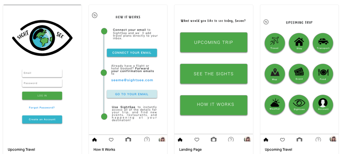
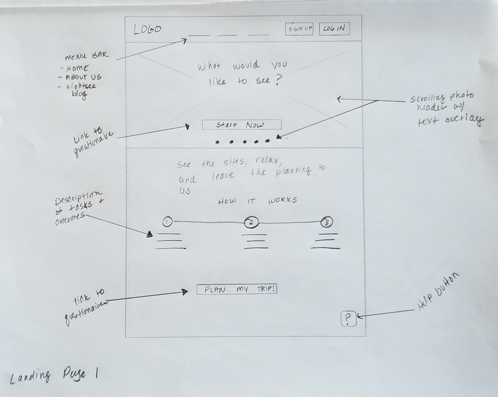
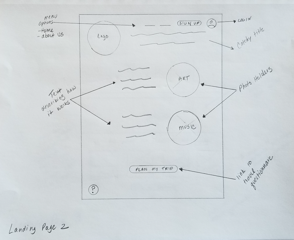
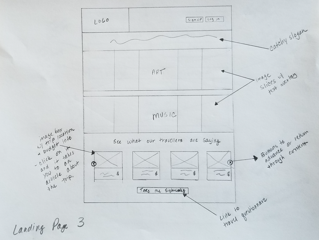
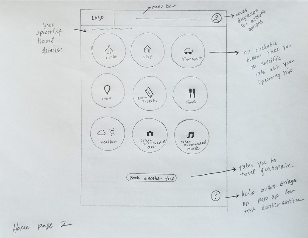
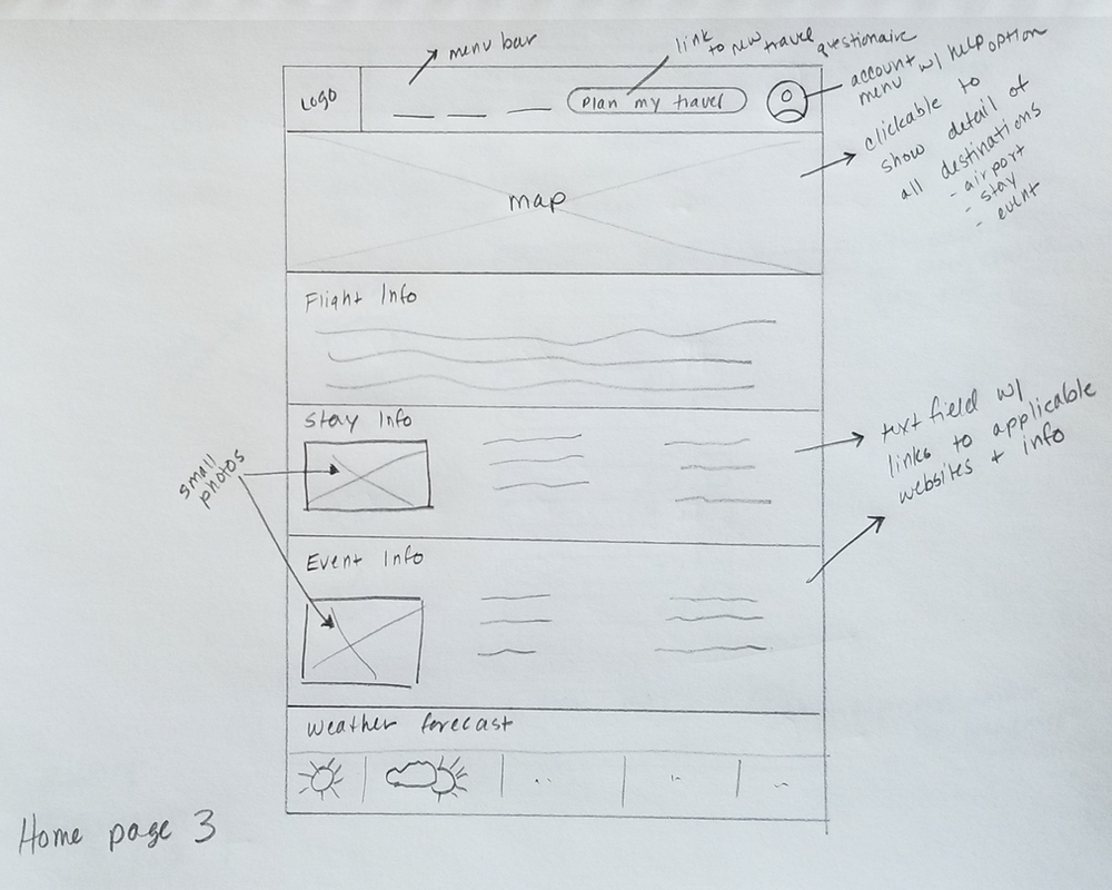
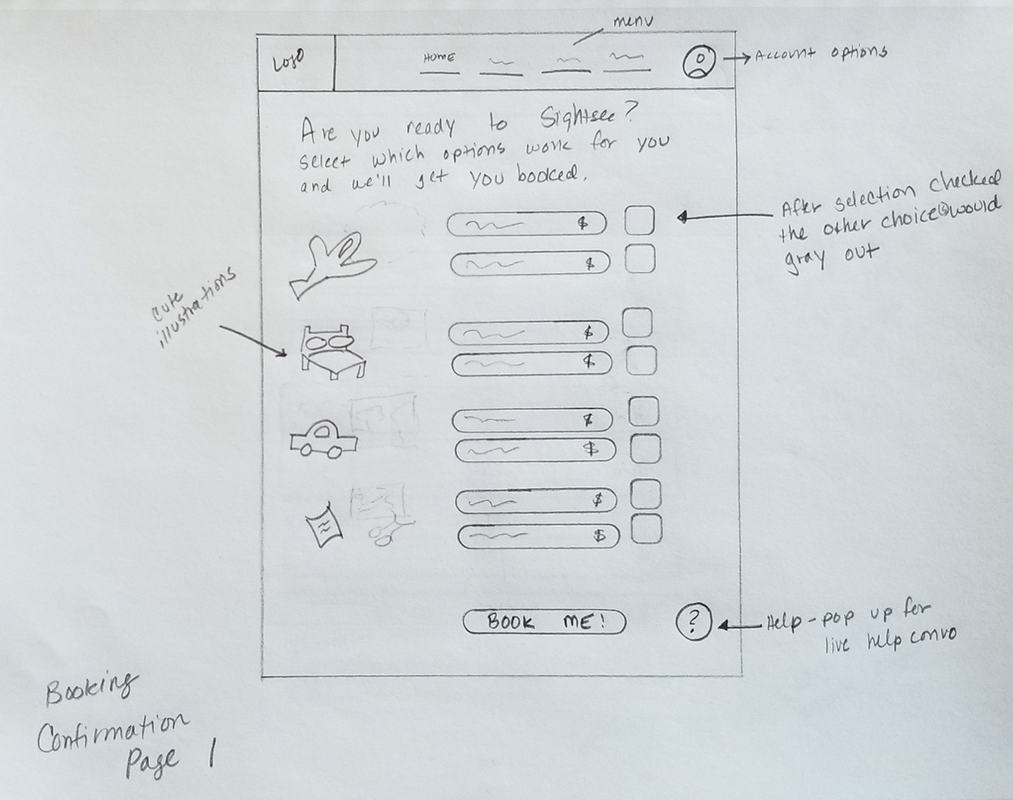
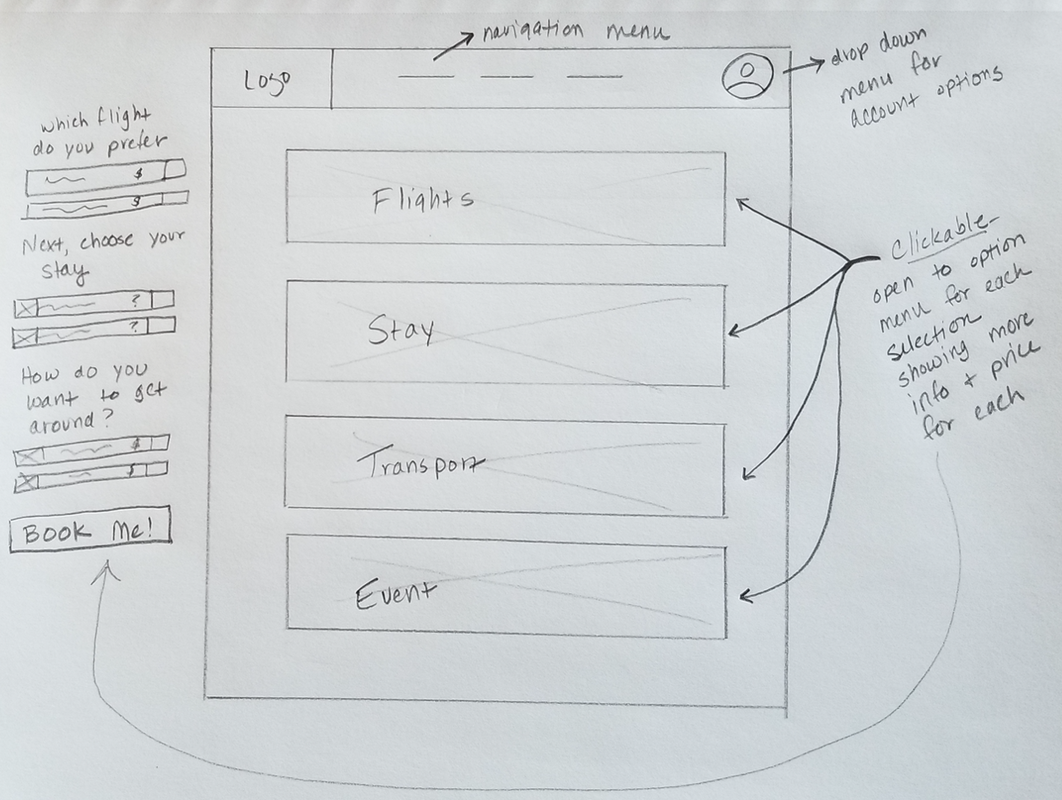
Have you ever arrived at the airport to realize you forgot to dig the confirmation number out of your email? Perhaps once at your destination you realized you weren’t prepared for snow? Travel can bring many headaches - being unprepared shouldn’t be one of them. Sightsee is an idea for a mobile app that would pull travel confirmations directly from your email account and store that information for easy access while traveling. It would provide maps, reservation information, local transportation options, up-to-date weather for your location, keep your travel documents safe and handy, and suggest events at your destination. While Sightsee isn't real, the process helped me think through the design problem and begin to build a useful solution for users. Have a conversationSince this was my first attempt at creating an app, I wanted to talk to people about their travel experiences. I chose five candidates ranging in age from 34 to 75. All of them travel often, use apps or websites to book travel, and are comfortable using the internet. I asked a range of questions to prompt responses about the last trip they booked, which apps they used, what they enjoyed about the experience, and what could be improved. I also asked specific questions related to my idea in order to gauge what level of interest they had in using a travel app. I learned that most everyone had a preferred booking app, and while they search around for price, they always book on the same app. They do so because it’s easy, the interface works well, and they know what to expect. All of those interviewed were interested in an app that provided maps, weather, and showed them local events they might not find otherwise. Map out user detailsInitially, I thought I'd create a booking app that accounted for budget, user favorites, and catered specifically to art and music lovers. This is how I mapped the user journey. Visualizing the pain points and outcomes helped show me where opportunities exist to improve the overall experience, particularly during the vacation. 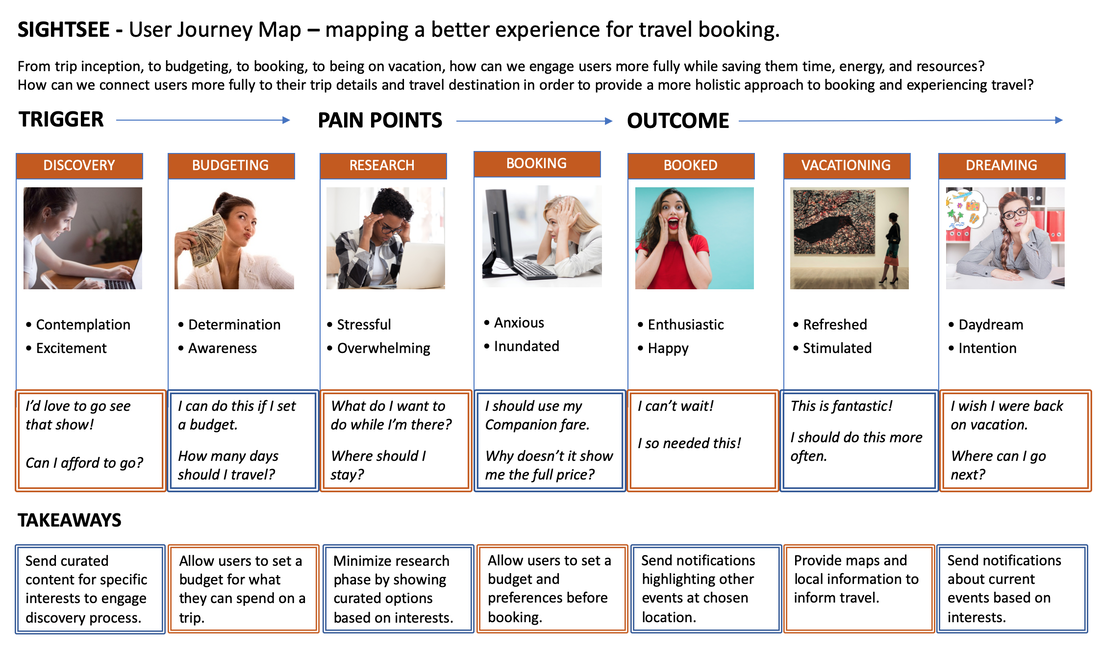 Consider the competition Now that I had a clearer understanding of my user needs, it was time to see what my competition was offering. Analyzing competitors allowed me to see what was working on their platforms, any design elements worth noting, the overall navigational flow, and the organization of information on each page. It’s helpful to look at apps and websites that directly relate to what you are thinking of designing, as well as those that are only functionally similar. 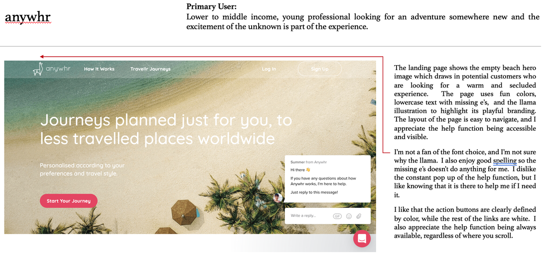 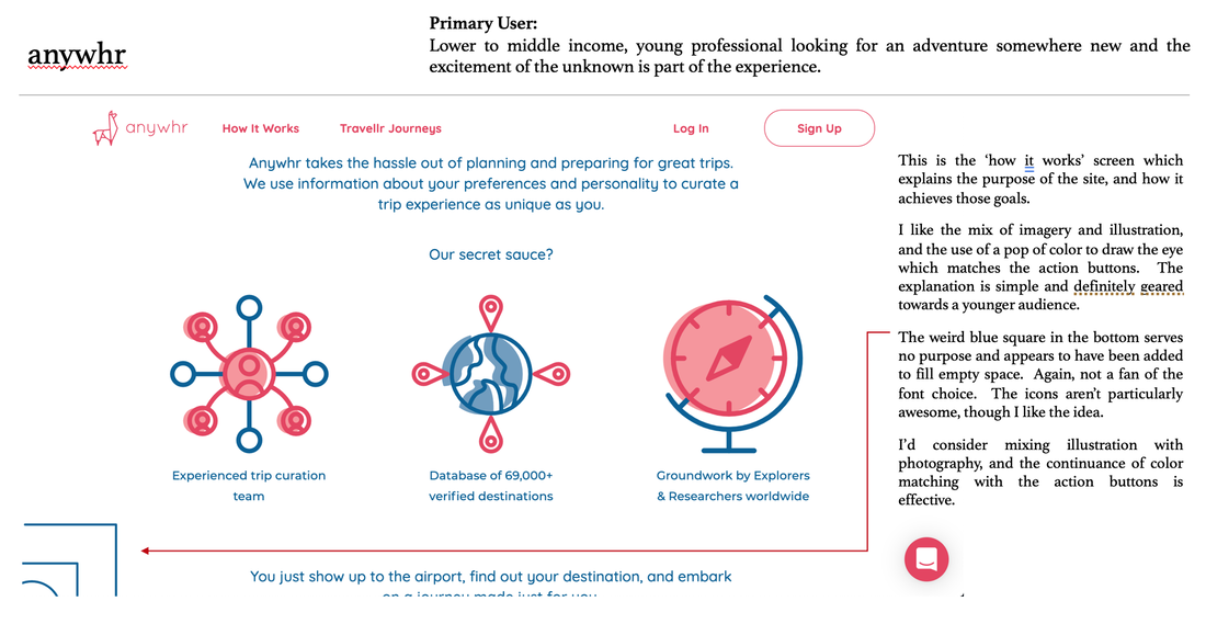 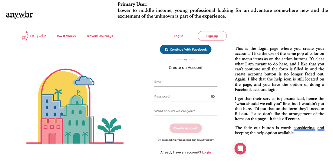 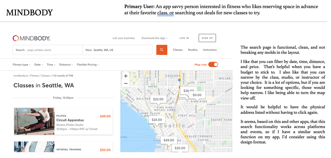 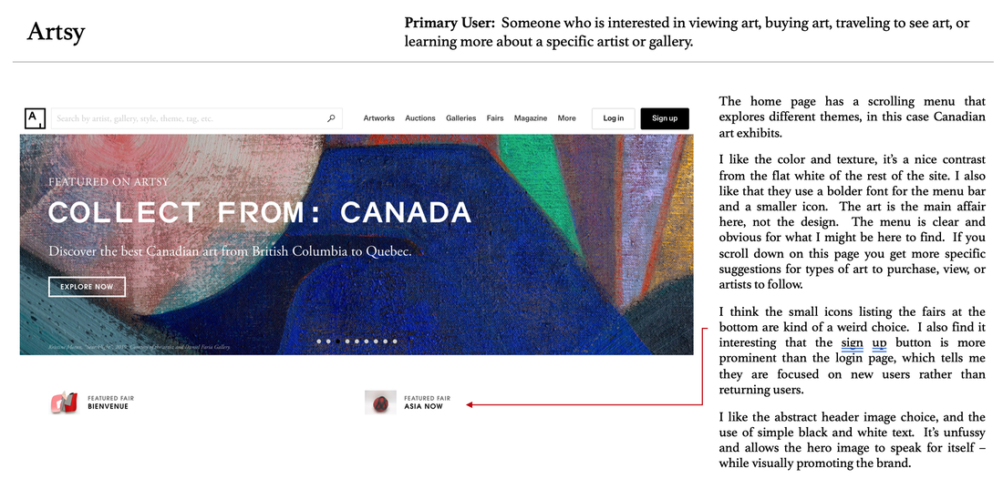  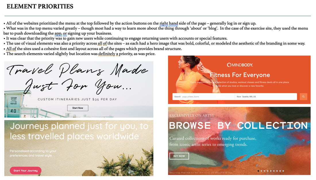 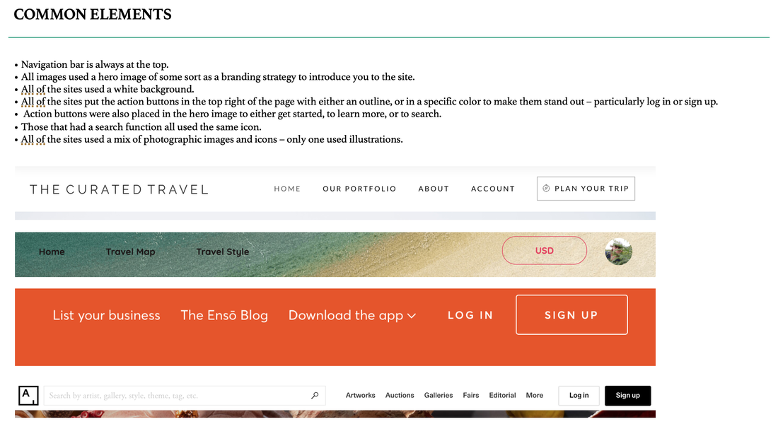 Navigate the experience With a head full of design ideas, I began to consider how a user would navigate through the experience I wanted to create. At this point I’m still working on the idea of a travel booking app, yet I’m already beginning to see the issues. I also know that my users like the apps they use for booking travel, and this is giving me pause. Regardless, the task flow provided a simple way to present the core navigation for the app, and to see how those actions would be interconnected. It’s a great way to work out the kinks, and to think about what I needed to include. I found that it helped to make a list of the steps on paper prior to mapping out the flowchart digitally. 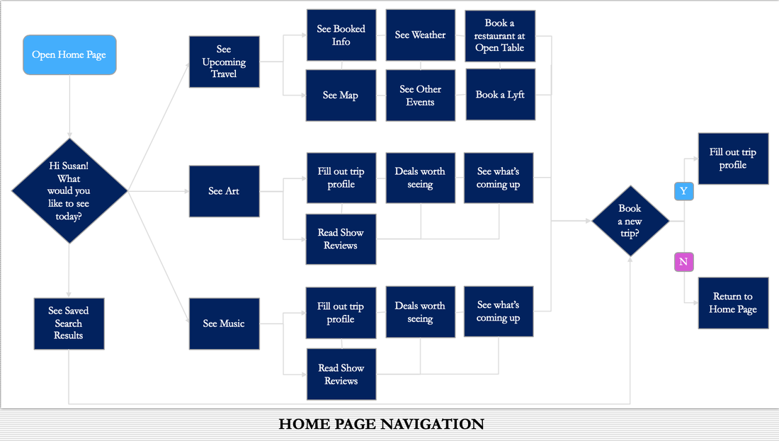 Paper and pencil Once I had the basic navigation in mind, I started to explore ideas for the design. It’s important to go a little bit crazy during the sketching phase and push yourself to look at what you are designing, what the iterations might be, and what the useful points of each look like. Sketching on paper is a great way to do this. It’s quick, it’s simple, and you don’t have to be great at drawing to hash out lots of ideas. Making it digitalUsing feedback from colleagues on my sketches, I began to narrow in on the actual design. I used Sketch to build basic wireframes. I found it productive to lay out multiple ideas and problem solve specific issues that came up in the feedback I’d received. I'm also aware that I haven't solved my user problem here, and I start to take a hard look at how to make that happen. 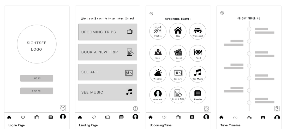 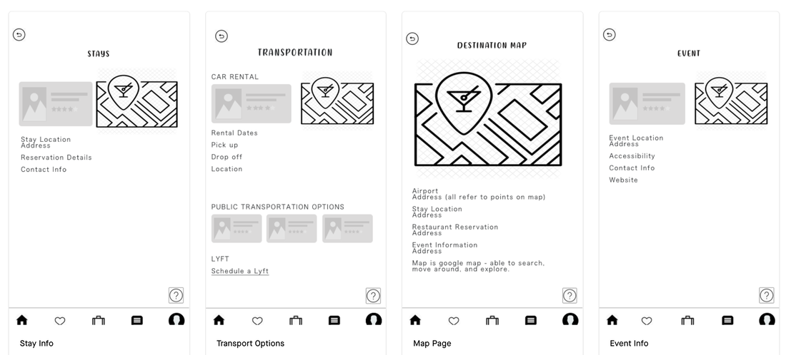 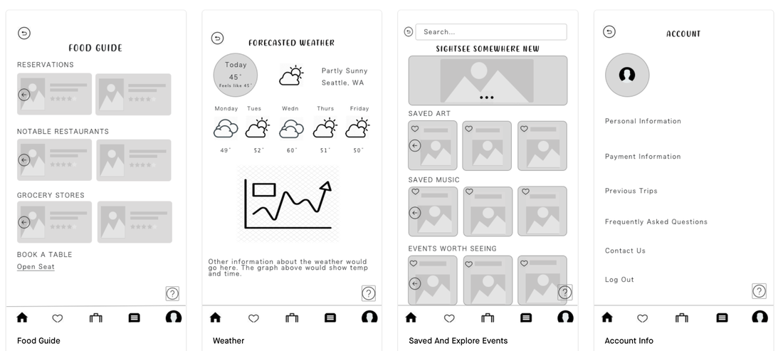 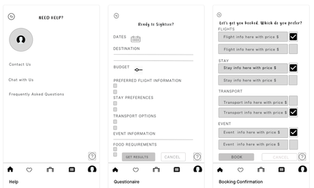 Site mappingTo work through the navigation, I found it helpful to create a site map. I wrote out each step on paper first, which helped me see what was missing, where my users might get stuck, and how to organize the connections. I begin to focus my design on creating a mobile application that organizes your booking confirmations and travel details in one place, rather than on creating a booking app. 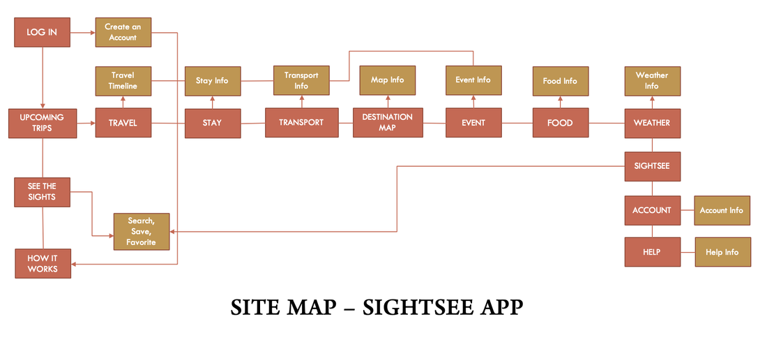 Click through testingOnce I had the site map, it was easy to create the navigation for the prototype. Moving my designs to Invision, I was able to build a shareable and clickable version for participants to use during testing. Using a high-def design with color and content meant that I could illicit more specific feedback from my participants. To test the functionality of the app, I had my users perform tasks:
 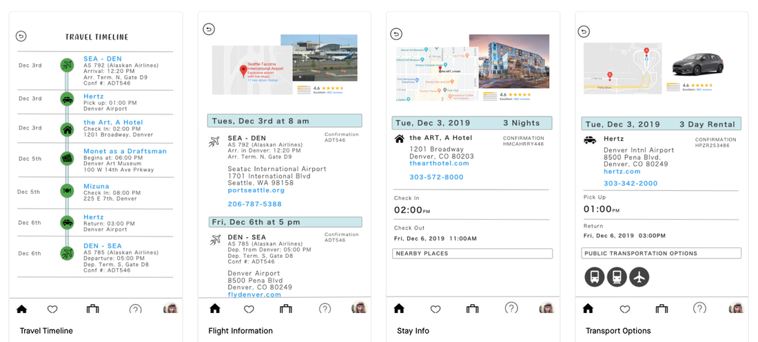 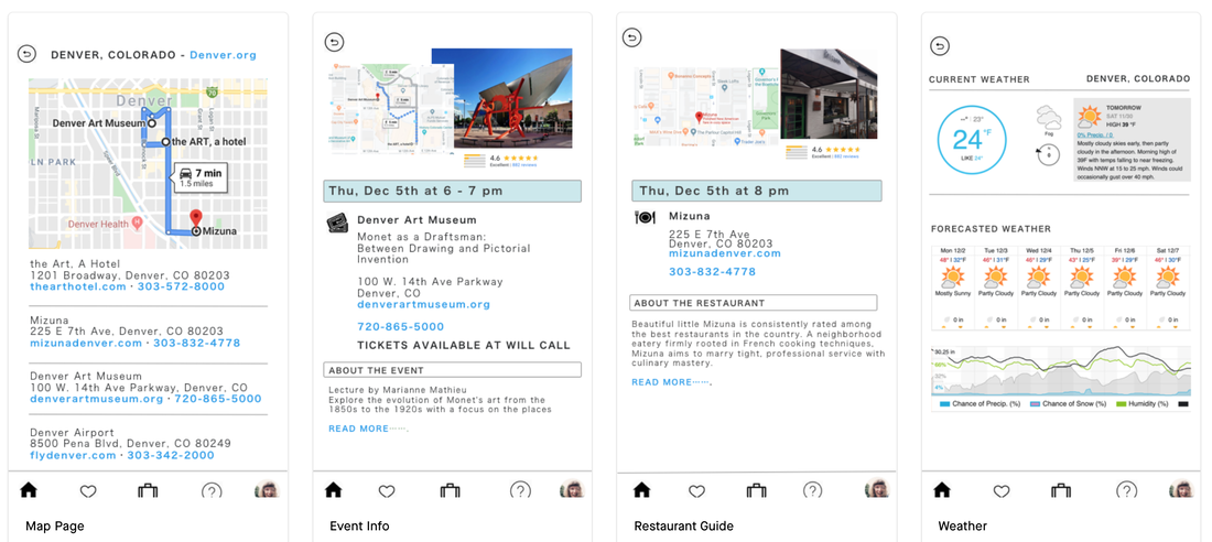 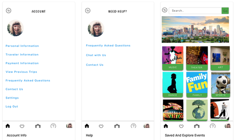 Testing ResultsEach participant quickly navigated to the information requested using multiple paths. The participants had a positive response to the design, maps, and layout of the information on each page. They appreciated that addresses, websites, and phone numbers were located on more than one page so that they did not have to click around. Things worth considering in future iterations are:
What I learnedDon't be afraid of big change. Keeping your users in mind throughout the design process is extremely important. Initially, I wanted to build a better booking app. What I realized is that I wasn't meeting the needs of the people I had interviewed. Luckily, in reconsidering my user experiences, taking a closer look at the pain points and opportunities, and thinking through competitor apps, I found a more elegant solution to the problem.
|
AuthorMusings on business, womanhood, consulting, and things I find interesting. Archives
October 2022
Categories
All
|


 RSS Feed